Amazon Kiosk
Designed the first kiosk experience at an Amazon Fresh store — pickup, return, and in-store guidance on a touchscreen with a barcode scanner, with no existing pattern to build from.
Role
Lead Product Designer
Team
Hardware partner, Engineer
Timeline
~8 weeks
Milestone
First kiosk at an Amazon Fresh Store
The problem
Amazon Fresh stores already had lockers for order pickup and return. But the existing locker screen only knew how to do one thing: scan a QR code. If a customer didn't have one in hand or didn't understand they needed one, there was no path forward. Store associates ended up walking customers through it in person, one at a time, at the exact moment self-service was supposed to remove them from the process.
Designing for hardware, not just a screen
The kiosk's entire input vocabulary was a touchscreen and a barcode scanner. No camera, no keyboard, no voice input; every interaction had to be designed within that constraint, on hardware that had to hold up to a physical retail environment: glare, people waiting in line behind you, and zero patience for a confusing screen.
There was no internal kiosk pattern to inherit from. This was the first one, which meant every convention; how errors surfaced, how long a screen could reasonably wait for input, what "stuck" looked like, got defined here first, not adapted from somewhere else.

Three flows, three decisions
Pickup
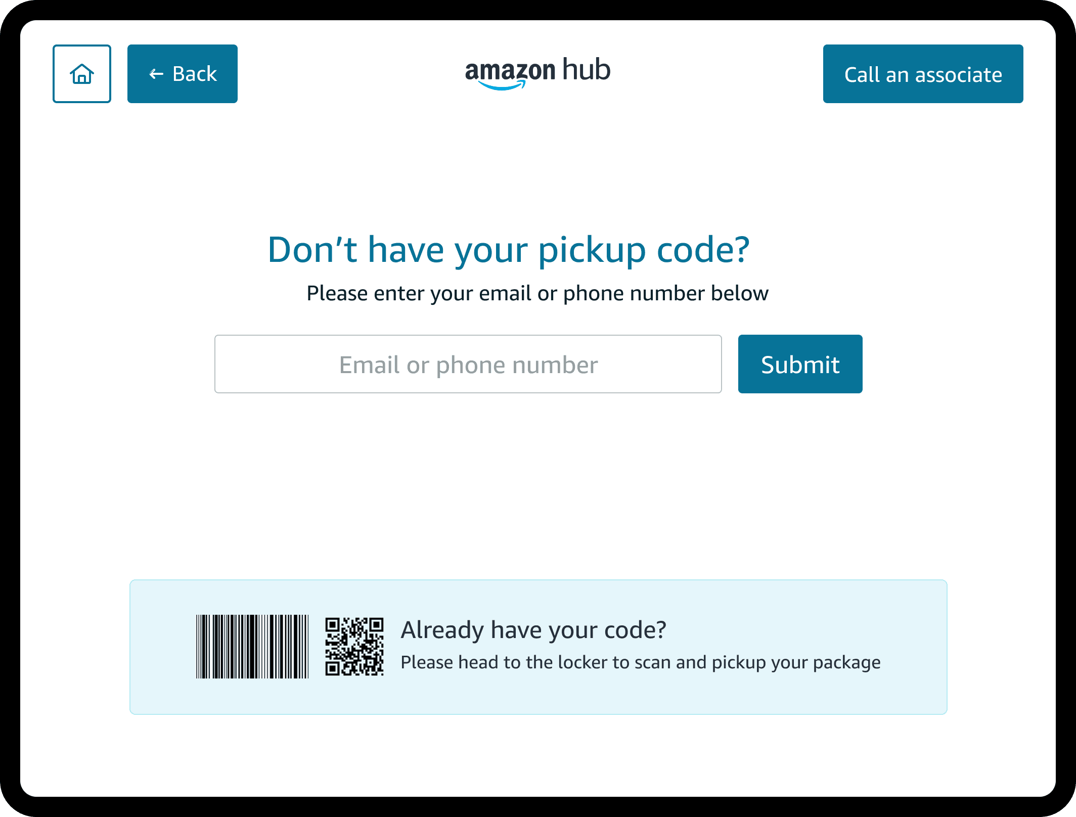
Enter a phone number, matched to the linked account and any pending order
Why: a phone number is something everyone has memorized. Requiring a QR code or confirmation email just reintroduces the original problem.


Return
The kiosk checks for a QR or barcode first. If one exists, the return completes on-screen. If it doesn't, the customer is routed to the counter instead of hitting a dead end.
Why: not every return arrives with a code in hand, and building a full manual-entry return flow wasn't realistic in one quarter. Routing to a person was the honest answer, not a workaround.


Learn
Instructions live on the kiosk itself, surfaced at the point of confusion; not a separate help screen or destination.
Why: someone stuck at a physical kiosk, with people behind them, isn't going to go find a help desk. Help had to appear exactly where the confusion happened.

Admin configuration

Alongside the public-facing kiosk, store associates needed a way to configure it during installation — the one screen-based, familiar-paradigm piece in an otherwise physical project. Where the kiosk itself had to be designed from nothing, this side could draw on conventional configuration-UI patterns, set up once per store and rarely touched again.
Where it stands today
The store footprint has since shrunk - but the kiosk model outlasted that contraction, with next-generation kiosks introduced afterward, building on the same core flows.
Reflection
Designing the kiosk meant deciding what belonged on a screen and what didn't. The counter wasn't a limitation; it was part of the design.